Background
MoMA's online ticketing system was optimized for timed entry slots, not a seamless purchase experience
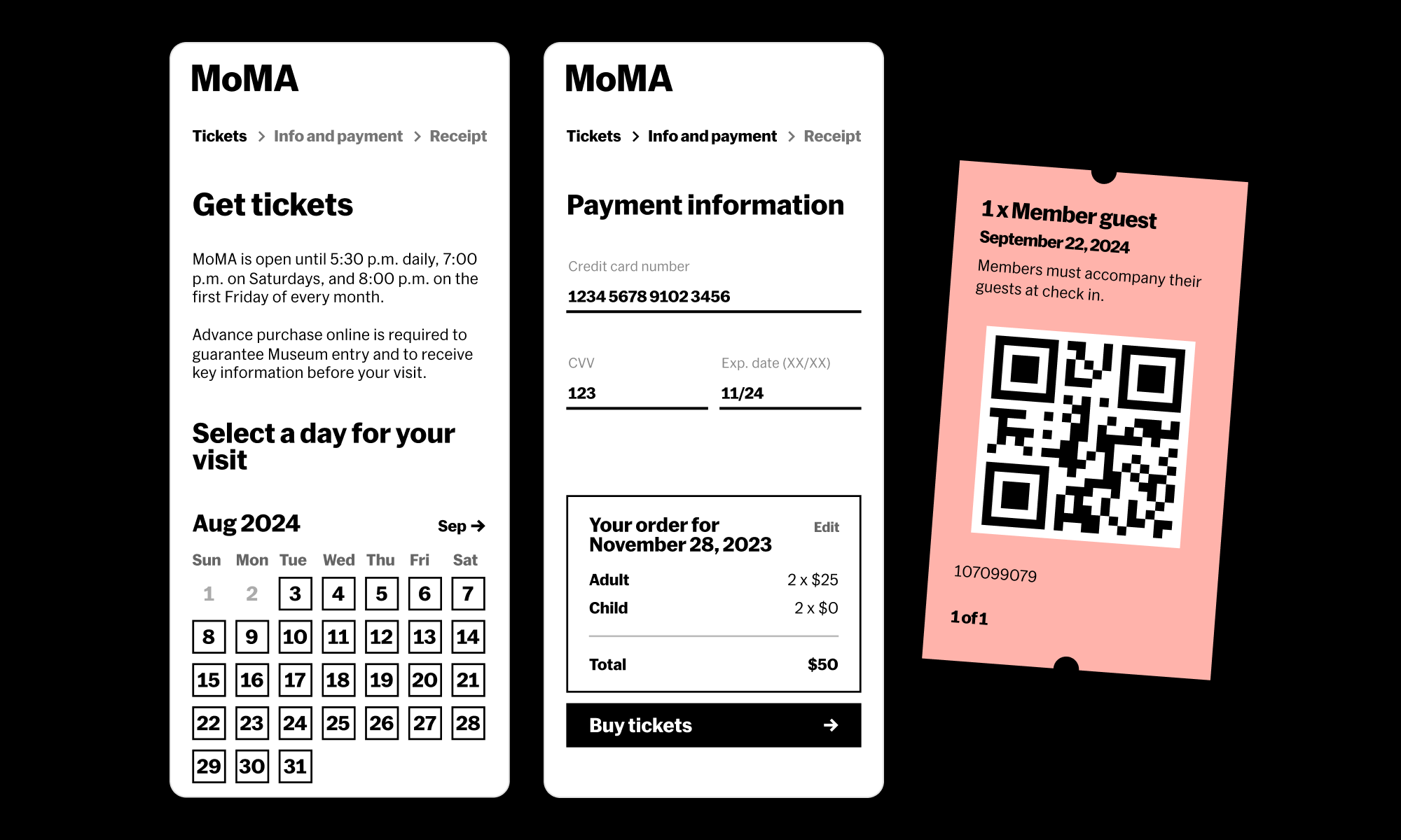
During the pandemic, MoMA adopted a timed ticketing system for admission in order to ease crowding. To stand up this solution quickly during uncertain times, the Digital Product team had turned to a white label solution. While the white label did a great job of handling time slots, its six screen flow took an average of 7 minutes to complete, was saddled with confusing out-of-the-box copy, and was unable to support membership or Design Store upsells. With timed ticketing no longer necessary, our team took the opportunity to build a ticketing solution in-house.
The old ticketing flow had five steps before the confirmation, and required visitors to sift through a lot of information to figure out which ticket types they were eligible for.
My role
My role in the project was to gather requirements from stakeholders across the museum (including those in marketing, membership, visitor engagement, and IT), develop user personas for our visitors, create high fidelity designs, and perform usability testing and A/B tests.
Approach
By trimming down the checkout flow, we were able to sell tickets faster, and get visitors excited to visit MoMA
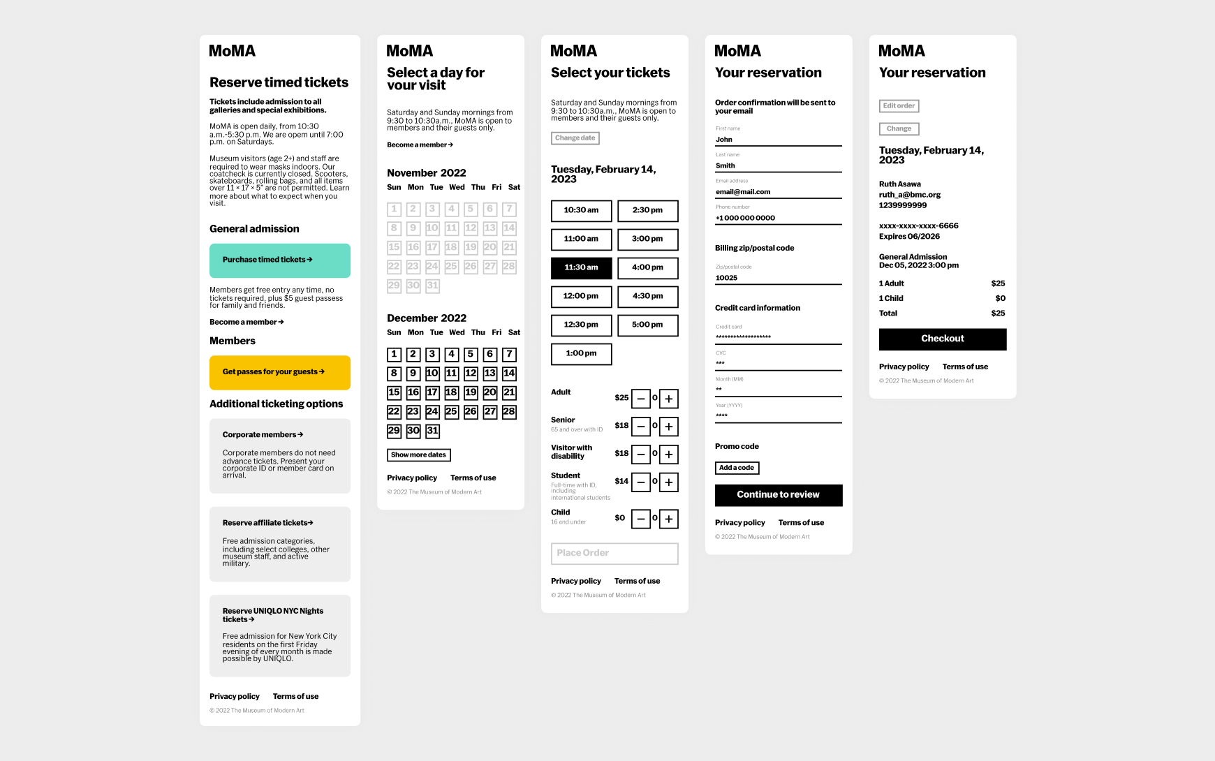
Our goal was to increase the percentage of tickets bought online vs. in the lobby—this was guaranteed revenue for the museum, and eased demands on our lobby staff. While our greatest tool was an online-only discount, we also shortened the flow from six steps to three to serve our primarily mobile ticket buyers, and audited all language to ensure maximum clarity. Surfacing our paid tickets types (highest purchase volume) to the top of the simplified ticketing list allowed most visitors to be on their way quickly.
We also prioritized preparing visitors for their day at MoMA by adding helpful resources and policies to the confirmation page and email.
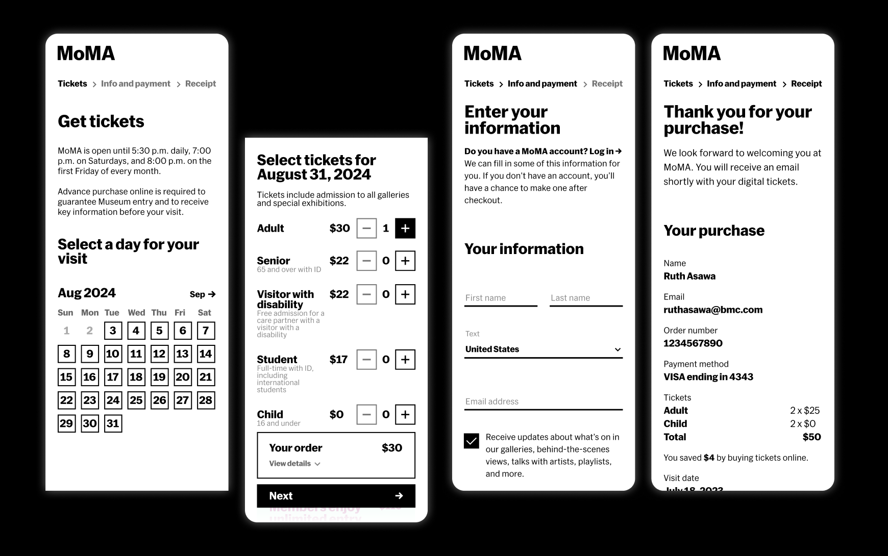
I reduced the new flow to encompass only three screens: selecting your date and tickets, entering your information, and a confirmation screen.
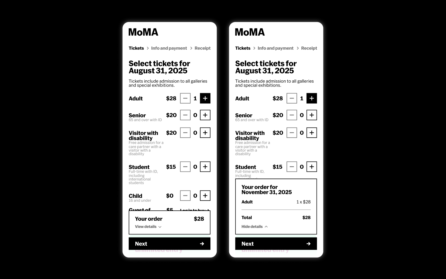
A persistent order summary box and progress bar allowed us to trim the “Review your order” page.
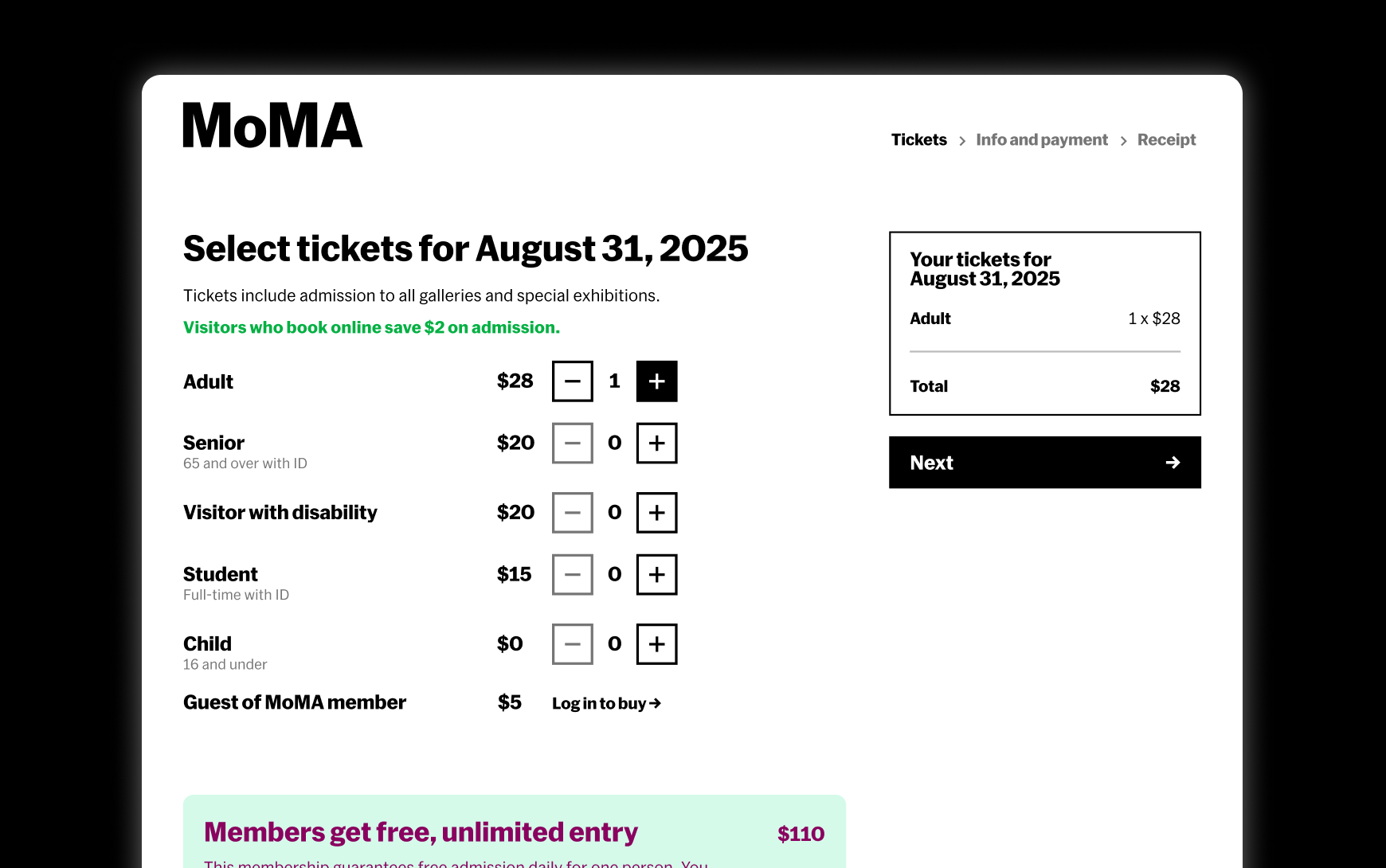
All paid ticket types were laid out in a scannable list on the first page of the flow, rather than prioritizing members (a lower proportion of ticket buyers).
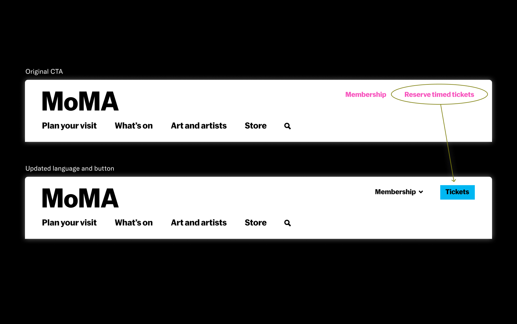
Simplifying the main ticketing CTA in the navigation from “Reserve timed tickets” to just “Tickets”, increased traffic to the ticketing flow by 15%.
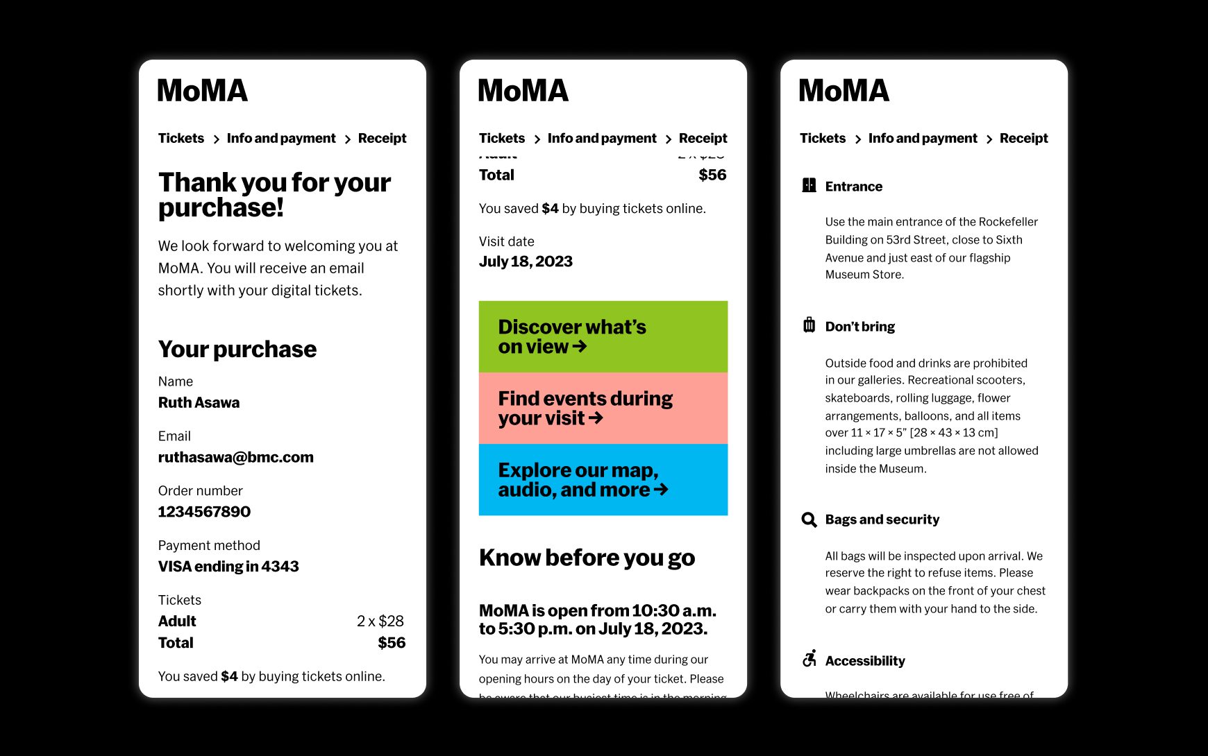
The confirmation page is one of our only opportunities to share visitor policies and resources. A timely reminder as most visitors buy tickets same day.
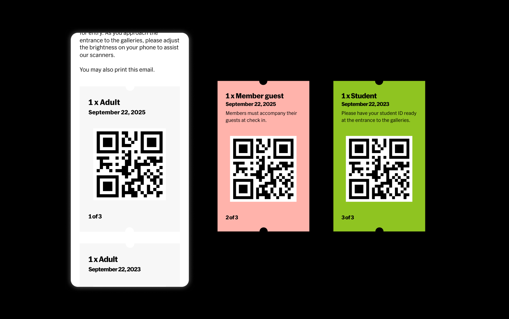
Bold, color coded tickets helped staff quickly identify who needed an ID check while scanning tickets for entry.
Outcomes
By focusing on an intuitive and accessible user experience, we saw revenue from online ticketing increase 4.5% in the first six months after launch.
For our users, the average time to checkout was reduced by over 50%. The new design also provided a foundation for future experimentation and testing by our growth squad, leading to a successful membership upsell offer system, and the addition of digital wallet payments.
We were able to make critical improvements for staff, like growing marketing’s email subscription list, and easing requests of our lobby staff by including visitor policies on the confirmation page.
Team
Michelle Pae (director of digital product), Rik Van Mechelen (director of IT apps), John Cline (director of engineering), Madhav Tankha (assistant director of UX), Debora Domass (product manager), Kengo Ikeda-Iyeki (front end developer), Anthony Hersey (back end developer), John Halderman (back end developer), James Duffy (back end developer), Tyler Cole (product manager), Deepa Ahmed (project manager)
More projects
-
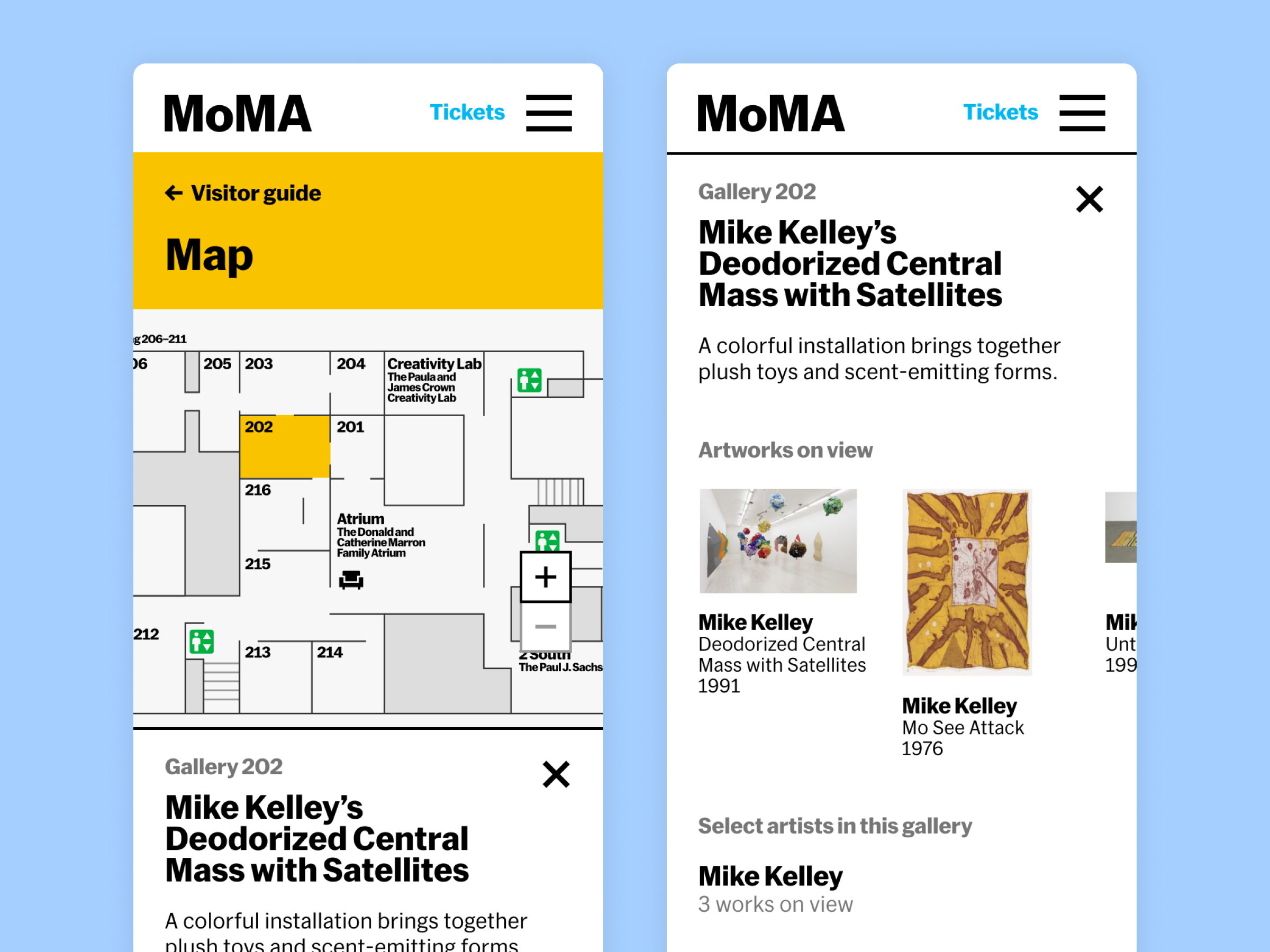 MoMA's Digital Visitor Guide and Map
Harnessing MoMA’s collection data to improve wayfinding for visitors
-
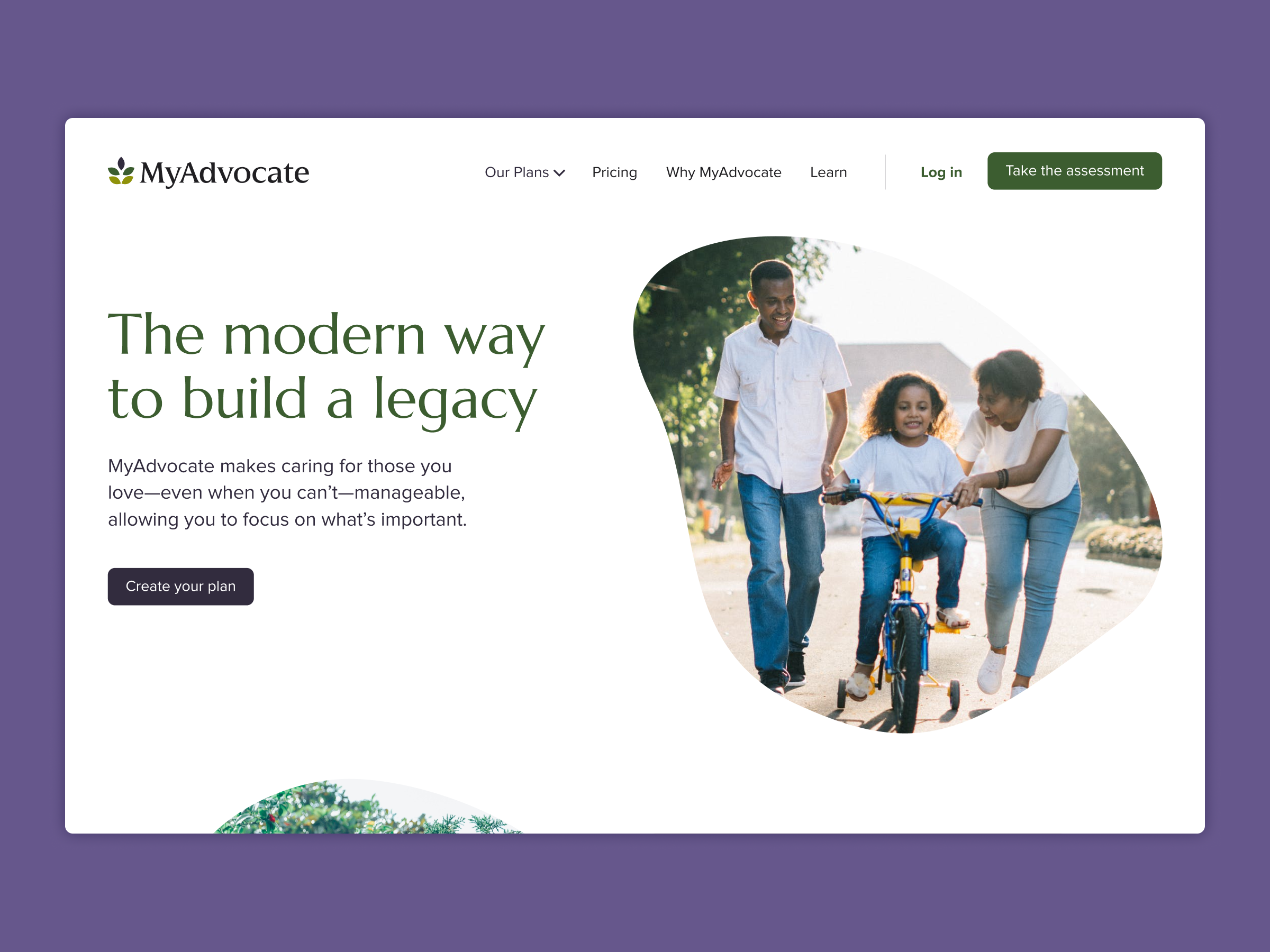 MyAdvocate
A marketing site that brings warmth and clarity to estate planning